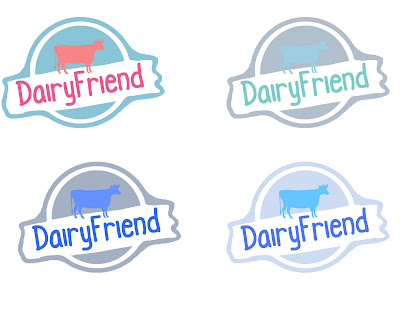
Whilst i am not sure on the name DairyFriend, i have constructed a few logo's. I have shown the steps in development, starting with the simple idea of a childlike font and i started with a simple colour scheme, of blue and brown. The blue is iconic of milk and often associated with dairy products, and the brown is supposed to represent nature and the countryside, like trees and wooden fences. I also included a simple cow graphic, as it is iconic of dairy products too. I experimented with different colourings, thickness of the circle and changing the shapes. I also smoothed out the angles of the logo so the corners were smoother, giving it a more flowing feel. Here are some versions of the current logo. My favourite is the second to last, and last one, as i feel the more i developed it, the better it looked. I like the border around the whole logo that ties it all together, although i am not keen on how the colours are working together, as i feel the blue and brown clashes. My research suggested that subdued tones and lower saturation can connote safety and reliability - this is important for a new brand, that people feel comfortable with it, so i de saturated the colours to make them a more muted, less bright.

I then experimented with the colours, as they weren't working together as id hoped, the blue on brown combination wasnt aesthetically pleasing, despite their connotations which i liked.
The bottom right was my favourite colour scheme, as its muted and subtle, the light grey blue is typical of dairy branding, and the DairyFriend name and the cow icon really stood out on the background, which is important. The different blue hue's work together well and are symbolic of the product.


No comments:
Post a Comment