Saturday 26 November 2011

current issues -

I have bought some scale figures of people, that i could possibly feature in my advert as the characters, whereas before i was going to imply the presence of the family using voices and the sounds of movement, but not feature them on screen in the advert. I am going to test out both ways of presenting the characters, and see which works best - considering the atmosphere created, the narrative and the way it changes or creates meaning in the advert.
Here are the characters -


Milk bottles - i was going to use plastic milk bottles that i could buy online, however they were all far too large compared to my structures, and i couldnt find any that were suitable. I have bought some Fimo- a plasticine that can be baked hard, so that i can model some milk bottles to scale to use in my advert. This should fix the problem, but i will have to wait and see if they are effective and look right in the advert.

Friday 25 November 2011

Initial constructing

I have now built the family house for the advert, and the delivery truck, both out of paper. I want them to deliberately cute and handmade, have an unfinished feeling, so they are not to scale or perfectly in proportion, but are artistic representations. I used a sponge to paint brick shapes onto the building, they are deliberately large, and made a smalle paper chimney and door. The overall design of the house is supposed to look traditional, the average representation of a house, and is supposed to look like a warm friendly family house. I printed the product logo onto the van, so the brand image is featured obviously throughout the advert.


 I made the window frames out of paper, leaving a space behind so I can light the building from within, giving it a warm glow. This makes the house look warm and lived in, and inviting, which is something I want to connote in the advert.

These are the first few pieces I have constructed, and i am please with the house, as I paid attention to the dimensions and measuring it correctly, I am going to re-do the van however, as I feel the front cab part isn't quite right, and I want to get it perfect as i am going to create 3 or 4 vans, and it is effectively one of the main features of the advert.

Wednesday 23 November 2011

Props list

I am going to build the entire set for my advert out of coloured card and paper, so I need to consider the key pieces to design and build, their colours, shape, and what i need to consider regarding connotations, e.g, do I want a modern looking home or a traditional style house? what meaning would each of these add to the text? and how does this work with the message I am trying to put accross?

Factory style building - this is the opening building, that will signify the whole factory, but I will only feature the loading bay, where the lorries are filled up. It will be grey and white, featuring the logo

several lorries - these will need to be identical and feature the product logo - (Finished 28/12/11)

roads - I will need to build a variety of roads, the will all be black, single track

landscaping - trees, bushes, anything that will give the background a sense of verisimilitude, and add to
the natural country like feel. I will play around with greens and ambers, to suggest seasons. I also need to build enough tree's to suggest a forest area (Finished 20/11/11)

A house - the house will be a traditional looking square house, to connote the traditional family orientated aspects of the product.  this will involve the main structure, windows, accessories. (Finished 10/11/11)

a bridge and a river - river will need waves to be cut out ( Finished 3/1/12)

tent - traditional style teepee tent

logfire - also traditional looking, natural (Finished 28/12/11)


Thing to consider next?


how long does each scene need to be? I am going to build them on seperate sheets of white paper, to act as infinity screens, I need to consider how big each piece needs to be, and which parts of the narrative will be on each sheet.


Sunday 20 November 2011

Storyboarding - in rough


I have done a rough storyboard for my first advert, considering the camera angles and their connotations.


Tuesday 15 November 2011

how has my research influenced my planning?

I feel like i have done some really useful research which should have a ;arge role in the planning of my advert, so i am going to look back at my previous research, and see how this is going to influence the planning stage, so i can consider all aspects of my advert against my research.


the 12 different types of advertising
- when researching into different advertising types, i found a theory by Donald Gunn, that all adverts fit into his 12 categories. If i were to categorise my advert idea in this way, i would probably fit it loosely into the exemplary story category, which is number 6 of the 12. The exemplary story is when the product shows a situation in which the product is in use, showing the audience a situation in which the product is neccesary and has purpose. This style of advert will be used for the most part of the advert, in which i show the product being taken out somewhere, because this is clearly showing the products USP and how it could be used, which is establishing a need for it. I am showing the audience a situation in which it is needed, therefore creating a gap in the market for it. I dont think however my idea will fit smoothly into any of these categories, as it is a mixture of a few, a hybrid. I think this piece of research has influenced my plannign greatly, as i have considered these different styles of advertising, whether i wanted to make a conventional piece that fitted into a category neatly or whether i wanted to make a more original advert that used elements of a few, that doesnt neccesarily fit with the conventions of the style.


codes and conventions


i looked at codes and conventions in advertising, with the intention to narrow this down when i knew what product i was looking at e.g if i was looking at bread, the conventions of bread adverts. However i have struggled to look at the conventions of milk advertising as there are very few milk adverts, due to their being very few successful milk brands. I have therefore looked broadly at conventions in dairy advertising, and found some obvious conventions, like the use of green and yellow, imagery of cows, and a country field backdrop. I am not subverting the conventions greatly in my advert idea regarding the mise en scene, as it is set in the country, with trees and fields. However, the use of paper stop motion is unconventional, most adverts are live action, and i wont be featuring cows or the product itself, so there will be no close ups of the product in use. I think the editing pace will also be much quicker than in conventional dairy ads. Rather than focusing on subverting the conventions, i am going to incorporate some of them into my advert. I feel that for advertising conventions are important, because so much information needs to be put accross to the viewer in a short space of time, conventions are a way of easily establishing the product with a consumer. If they see cows, rolling hills and a feel-good backing track, they will immediately presume it is a dairy product, without having any information about it. I think this is important to remember, as viewers often dont pay attentiin to much of the ad, so it should reflect the product throughout, by using conventions that viewers associate with dairy adverts.
Advertising psychology -

means to end theory-

"The key stages in the formulation of this concept are: need identification, idea development to fulfil the need, product development to substantiate the idea and the product’s market introduction. communicating the fulfilment of the need Central here is the ability to ‘‘translate’’the subjective consumer needs (e.g. healthy, convenient) into objective product specifications, in order to, through the creation of the product, fulfil these needs."

My advert idea would fit means to end theory, in that i have indentified a need for the product ( a milk product that is flexible to travel), developed a product that fulfils the need, and then in the advert i will be communicating to the consumer that there is a product to meet the need. I am also taking the consumer needs e.g convenient milk drink and makign a product with these specifications to fulfil these needs.

Hierarchy of effects model
- if i were to use this theory, my advert would be aiming to achieve the first two steps, Awareness and Knowledge, as most adverts would do for new products. This theory suggests that before a consumer can decided to purchase a product, the first two steps are to be aware of it, and have some knowledge of it. My advert would be introducing and branding the product, and providing some information about it, what it does and why it is needed. It would also aim to achieve the next step, liking, as the advert will try and connect with the target audience to create a brand that they like.

Advertising standards
After looking back at my post on advertising regulation, i have looked back at the document to see if i could find anything that would be important to consider when advertising my product, as when i first did this piece of research i looked at just a few general rules. I didn't find any rules that i felt were applicable, and so i dont think there is anything that would particularly restrict my advert.

Stop motion research
This was one of the most useful pieces of research i have done regarding my advert, as i was able to see what was key to producing a good quality stop motion animation, and the quality of the animation is something i am worried about. I found these main points, and i will pay specific attention to these when producing the advert:

- the use of bright bold colours is really important
- a mix of 2D and 3D objects gives depth and makes it look more interesting
- a mix of camera angle is important, birds eye view works well for 2D objects
- lighting is important - bright lighting is key to making the animation look proffessional, a yellowy tinge from artifical lighting of unwanted shadows will make it look amateur
- sound is crucial, although i dont need to worry about this until post production

how am i consideirng these points?
- I am intending to make my advert from coloured paper and card, therefore using only block colours, they will be bright and colours will be exaggerated, so grass will be shockingly green.
- i am going to construct most of the environment from 2D objects, the trees and the landscape, but then add features that will be 3D, such as bridges, the car and the house.
- I have included a range of camera angle in my storyboard, and will experiment while shooting in a range of angles, then review which has worked best.
- I will make best use of natural light, with the add of two lamps fitted with natural bulbs.

Sponsorship sequences

from the research i gained some knowledge of how sponsorship sequences work together, when planning my sponsorship sequence i will use this knowledge to make sure there is synergy between the main advert and the ancillary tasks. I also looked at the conventions of sponsorship sequences, and will consider these when planning mine, whether i want to subvert them or make a traditional conventional sequence.

Further advertising psychology
Low involvement/ rational
consumers put little thought into purchasing these products and they are chosen for their benefits and product attributes, so the consumer will pick a brand that satisfies the need. Example products could be a ready made sandwich, Deoderant, shampoo, milk. They are cheap everyday products and once a consumer ahs settled with a brand that fulfils the need they are reluctant to change and try other brands. Advertising therefore needs to focus on differentiating the product, making it stand out from the rest, whether this is actual differentiation or perceived differentiation ( differentiation in the eyes of the consumer achieved through clever advertising and branding

Consumer involvement theory
I have considered this theory when planning my advert, as it is a low involvement/rational product. This means it needs specific attention to differentiation as the product is chosen on its attributes alone, there is little thought gone into the product, it is just chosen on what seems to be the best. I am therefore going to make sure my advert highlights my products actual differentiation, and also uses perceived differentiation. The actual differentiation is the packaging and the idea behind it, althought UHT milk is not different. The perceived differentiation will be created by the branding, which is key to the product. I will be pushing the products differentiation on the advert, and this will be the main focus.

Affective conditioning
Affective conditioning theory suggests that consumers pick product that are assoicating with good things, not neccesarily products that are in fact superior. I considered this when plannign my advert, and so have set the narrative in the countryside. it will then be associating the product with nature and the countryside, and with a nice simple soundtrack will make it appear natural and nice.


Monday 14 November 2011

The idea - From Us, To You, To Anywhere

I have come up with a basic idea for my advert, a frame to work on. It has a strong narrative, and is based on an idea i had for a slogan "From Us, To You, To Anywhere".
  •  The advert would start with a lorry at a loading bay at the DairyFriend factory, it will feature the logo, so the brand is immediately established. 
  •  milk bottles will trail into the lorry, symbolising it being filled up. From my research into stop motion i found a great deal of it is symbolic and metaphorical, doesnt directly represent the action.
  • The lorry will start up and leave, travel down a road lined with trees, with feel-good music in the background. This music will establish a happy mood, and assoicate the product with good feelings in the minds of the consumers. The trees are a convention of dairy adverts, and connote that the product is natural and organic.
  • The lorry will reach a traditional looking house, this is establishing the target audience, as it will be a sizeable family house, implying the product is suited for middle to upper class families. We will not see the family, but their voices can be heard as they hurry into the car.
  • When the lorry reaches the house, the mik bottles will trail out and into a stationary car outside, the car will then start up, and the camera will then follow the car instead.
  • The car will drive down the road, and begin a journey along some country roads.
  • It will then drive through a forest and end at a campsite, with a traditional style tent and a campfire, once again connoting happy family times.
  • The ad will end with the slogan, From us, to you, to anywhere, and the camera will blur.
  • The same soundtrack will feature throughout, plus atmospheric sounds, like trees rustling, car engines and laughter.
  • The whole advert should have a laidback natural feel with a focus on the family and having fun.
Advert number two - how will it differ?

  • advert number two will have the same narrative structure, and the same narrative, that the product comes from the factory, to the home, and then on an adventure
  • It will begin much the same, and use some of the same footage, so they will be virtually indestinguishable until the house scene
  • at the house, the voices will be heard preparing for the beach instead of camping
  • the car will drive along some country roads and then along the seafront, stopping when it reaches the beach, there will be atmospheric sounds of the seas waves and seagulls
Things i need to consider now i know what my narrative might be -

- How i will achieve this with paper, what the limitations are
- what i need to build for the set, all the scenery and the props
- what the shots will look like, and storyboard it.
- finding music that fits the narrative and is royalty free
- scripting the voices in the house
- how the ads will end - im not entirely sure yet of the exact way i will end them, will i feature the product, feature the slogan on screen or as a voiceover, fade out or blur out?

Conventions of dairy advertising

I have been looking into the conventions of dairy advertising as a whole, as it is difficult to gain an understanding of the conventions of advertising milk, as there are only a few milk brands, and very few milk adverts besides the cravendale ads. I looked at a multitude of adverts for yoghurt, cheese and butter and have come up with what seem to be the conventions and codes

Obvious conventions -
- images of country side and greenery, signifying a natural, seemingly organic product
- free range cows, whether this is how their cows are treated or not, this gives the product a good brand image
- references to "british heritage"
- lots of branding, featuring the logo and products colours where possible, as much of the selling point of these product is their branding - no actual difference.
- a clear display of the product in use, pouring milk or spreading butter, often a close up
- upbeat, feel-good music, helps the consumers bond with the product.

Some screen shots of what i consider to be conventional adverts -


Friday 11 November 2011

Product packaging

I have decided on a plastic container, in the shape of a traditional old style milk bottle, for a multitude of reasons. I have made a mock up of what the product would look like, by labelling an existing mik bottle using the logo as a wraparound label.


Target audience

My target audience is going to be very broad, aimed at late twenties and over, this is an older adult market, those who would do the family shopping or are responsible for their own food. It is also intended to be a premium product and so aimed at those with higher incomes, to reposition UHT milk.  It would be mass marketed, and so advertised on mainstream terrestrial channels such as Channel 4 and ITV1, but could also be aimed at slightly more niche specialist channels such as FoodNetwork, which could also reach my target market. I am going to reflect the target audience in my advert through a variety of techniques, although the Stop motion element is unconventional for an advert aimed at an older segment in the market.


i have some possible questions i could ask my target audience through a survey -


what do you buy milk based on? brand,price,healthbenefits

what style adverts prefer? connect with?

circle adverts you personally like?

could you see a need for a portable milk product in these situations? or would you personally use a portable milk product in these situations?

what do you consider when purchasing milk? do you ever try premium brands?

what is your view of UHT milk?

which of these advertising techniques do you feel are effective on you, i.e make you interested in the brand. whether consciously or subconsciously?

I am going to conduct audience research in the form of a questionnaire, to see what the audience connects with. This will give me some valuable primary research, which together with my secondary research will give me an idea of my target audience needs.


Thursday 10 November 2011

Packaging

I am going to think about the packaging in depth, on the whole Longlife UHT type milk brands are packaged in rectangular tetrapaks. These are the typical packaging for treated drinks such as milk, juice and wine.  I think part of the negative stigma around the UHT style milk is the cheap packaging that doesn't  make it look expensive. I think to reposition this kind of product as a premium brand i need to consider making the product look expensive, both in the logo and packaging. I have looked at options for UHT milk, including the standard glass bottle, Tetra pak cartons, plastic bottles and portions.

The Tetra Pak -


- Advantages
- easy to keep fresh and sterilised, which is why it is so commonly used
easy to store and pack, as they can be stacked
- can be labelled and designed brightly, so the whole package can be eye catching
- not expesnive

disadvantages
- stigma around the packaging - thought to be cheap looking


Classic glass bottle


These are not commonly used for milk bought from supermarkets, but for home delivered milk, they are then picked up by the milkman and re used, making them completely recyclable.

Advantages
- recyclable
- Kitsch and homely looking - people quite like the iconic look of them
- can be sterilised easily

disadvantages
 - expensive material
- could not collect the bottles back like milkmen do
- difficult to carry around with you- the idea of the product is its flexibility to be taken anywhere, a glass container is not travel friendly.


The modern plastic milk bottle

Advantages
- cheap packaging, but doesnt look as cheap as the carton
- recognised as modern milk, mostly used for fresh milk, so could relate the product to well known fresh milk brands
- more travel friendly than glass

disadvantages
- perhaps looks too much like fresh milk? could be misleading


Choice


- I am thinking of a classic milk bottle shaped bottle, but made of plastic, it would still be widely recyclable but less expensive to make, would travel better than if made of glass, and this is the most important thing that it could travel. I think it would lose some of the stigma of a UHT product if it were packaged in a traditional looking bottle, that would look classier and traditional, and may encourage people more to consider the product if it were packaged to look less cheap.

Thursday 3 November 2011

Logo design

Whilst i am not sure on the name DairyFriend, i have constructed a few logo's. I have shown the steps in development, starting with the simple idea of a childlike font and i started with a simple colour scheme, of blue and brown. The blue is iconic of milk and often associated with dairy products, and the brown is supposed to represent nature and the countryside, like trees and wooden fences. I also included a simple cow graphic, as it is iconic of dairy products too. I experimented with different colourings, thickness of the circle and changing the shapes. I also smoothed out the angles of the logo so the corners were smoother, giving it a more flowing feel. Here are some versions of the current logo. My favourite is the second to last, and last one, as i feel the more i developed it, the better it looked. I like the border around the whole logo that ties it all together, although i am not keen on how the colours are working together, as i feel the blue and brown clashes. My research suggested that subdued tones and lower saturation can connote safety and reliability - this is important for a new brand, that people feel comfortable with it, so i de saturated the colours to make them a more muted, less bright.


I then experimented with the colours, as they weren't working together as id hoped, the blue on brown combination wasnt aesthetically pleasing, despite their connotations which i liked.


The bottom right was my favourite colour scheme, as its muted and subtle, the light grey blue is typical of dairy branding, and the DairyFriend name and the cow icon really stood out on the background, which is important. The different blue hue's work together well and are symbolic of the product.

Logo research

Logos are what distinguishes a brand or product, and is part of branding of a product. they can be purely graphic or contain information about the brand. including name and date of establishment, or sometimes location.

factors to consider -

Color is considered important to brand recognition, certain colours can convey certain feelings or messages. Green is often associated with the health and hygiene sector, and light blue or silver is often used to reflect diet foods. For other brands, more subdued tones and lower saturation can communicate reliability, quality, relaxation, or other traits.

- the values of the brand, the logo along with the product name should reflect the values

- there are some psychology associated with logos -  people recognize and react to color, shapes, lines, fonts and other symbolic forms with emotions tied to their experiences.  Horizontal lines often communicate a leveled security. Vertical lines convey dignity, and diagonal lines are full of energy, suggesting either rising or falling, or movement in one direction or another.

- dynamic logos- have a similar format and are recognisable as the same brand but change and develop, example is the google logo, which constantly changes with seasons, historical event etc. but there is always one main logo.

- imagery and what it connotes - visual imagery that associates the brand with good things is important - like the tree in coutrylife butter logo connotes the product is natural

Existing milk logo's

I looked into exisitng milk logo's from around the world, and these are a few of my favourite that I found. Most of them are pretty similar and feature classic iconography that the audience will associate with the product.


conventions -

- they almost al feature the blue colour - which is often associated with dairy products, white which is the colour of milk, so represents the product itself, and green which connotes nature and the countryside, in turn connoting the product is natural and healthy.

- most are fairly circular in shape, or look like a stamp, they therefore look a bit like the top of a bottle

- they all feature the companys name, which ties the product to the logo

- many of them feature imagery of a cow, this is directly linking the logo to the product, as it is symbolic of milk


- my favourite of these was the Heber Valley milk logo, because of the colours used, which are symbolic of milk, the cartoon style image of the cow, and the shape of the logo which also connotes the natural element of the product, with the hills in the background.

I am going to consider all these elements when i design my product logo.

Wednesday 2 November 2011

brand name

I need to name my product, something catchy and effective, so i have conducted research into existing brand names in the dairy sector, which are effective, and which aren't, and also on how to name a product successfully.

Product name research

descriptive - the name states what the brand is or what the product or service does - Toys R Us, Lactofree

evocative - it suggests associations to the brand without describing the offer precisely - Amazon, Flora, Gu

abstract - it makes no reference to the nature of the business - Ipod

amalgams - names created by putting words together - Nabisco ( national biscuit company )

rhyming - memorable and catchy - YouTube, Utterly Butterly

foreign word - sounds sophisticated - Perle De Lait, Petit Filous

Founders names - not too catchy, traditional -Sainsburys

Personification - gives a character - Green Giant

Clever statement - I Cant Believe Its Not Butter


Product naming is a critical part of the branding process, as it conveys messages about the company and the product.

key properties of a successful brand name -

- they imply the brands benefit

- they are available for legal protection

- they have a symbolic association that backs up the company ethos or image

- they appeal to the product target audience


existing milk brand names

LactoFree - This name is very obvious and is a descriptive style name - as it clearly describes the product, it implies the brand benefits well and will appeal to the target audience who will immediately understand it is for them. It is an obvious choice, but i think it is very effective as it immediately establishes the target audience .


Cravendale - This name is more abstract, but it is in fact quite evocative - the Crave part suggests longing and wanting, and a dale is a valley, associating the product with nature, conveying their message about cravendale being fresh and natural.


Yeo Valley - Whilst this is technically a brand name, it is the name they use for their milk too. It is an evocative brand name as the word "valley" also connotes nature, freshness, purity.


Countrylife - also a brand name that makes milk under the same name - also evocative of the brands image - it connotes the country, nature and once again freshness.


All of the brands have the evocative features in common, because they all suggest nature and the countryside, which in turn connotes freshness, heritage and ethical farming. These are all things which the company's would like the brands to be associated with.

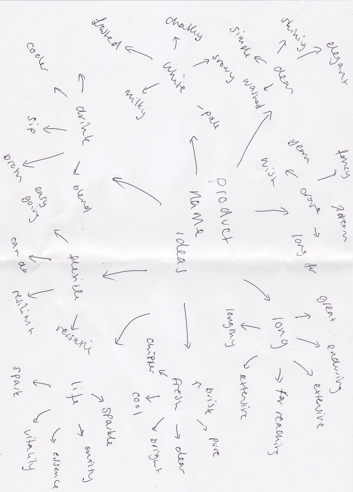
I did a brainstorm around the main features or selling points of my product, using some of the words that came to mind when i thought about the product - descriptive words, and then looked at alternatives in a thesaurus, this would give me an evocative or descriptive brand name.


After this i used an online name generator with multiple options to generate random names -
I typed a word in, and played with the options which included combining the word with rhymes, common words, prefixes or word parts and sounds. This gave me a multitude of generated names, most of which were unusable

here are some examples of ones i considered to be the best-

FreshBell .   FreshBliss   . FreshBounce   . FreshSip   . EverFresh

- i then thought fresh didn't sound like a milk product, because it sounded too much like a hygiene product, and this wasn't giving a good association to the product. However i quite like FreshSip. I then thought of the obvious, and put "milk" into the generator

MilkMist.   DairyTree.   DairyFriend.   DairySip

DairyFriend- 

- I think DairyFriend has good connotations, as it suggests that the product is friendly and inviting,
- also that it will stick by you, this is the message I am trying to convey about the product, that it can be taken anywhere with you, like a companion.
- It is easy to say and remember and sound fairly inviting
- . However it is also very obvious, and doesnt neccesarily explain the products USP.
-  It makes the whole company sound friendly and inviting.

EverFresh

- However i also like EverFresh, it is a very obvious title, much like LactoFree, in that it is a fairly short way of explaining the products unique selling point, that it stays fresh.
- however is it too obvious? and therefore not particularly memorable? people often remember things they find funny or interesting.
 - Also, does it sound like a milk product? or does it sound too much like a feminine hygiene product? because that would be a terrible thing to associate the product name with. 

I took a vote between DairyFriend and EverFresh, not because they were deifntiely the final two to choose between, but because they seem like the best names currently, and simply to see the reaction they would get from possible consumers. comments i got were -

"what about DairyFresh? that would make more sense given the product description"

"DairyFriend is better, EverFresh sounds a bit like a deoderant name"

I am still undecided after this research, but I have come a great deal closer to settling on a product name, probably between DairyFriend and EverFresh, although the product name may evolve from these. I may do some more in depth audience research at a later date.


Product

the idea

the product idea is a longlife style milk that is therefore able to travel, so is a flexible milk product that could be taken anywhere.

Audience

It will be marketed towards wealthier upper class people, a wide audience of late 20's upwards, who need the convenience of a milk product they could use on the go, both male and female. Their is often a negative stigma around UHT style milk, in that it is less flavoursome and for poorer people, it is not classed as a luxury product.

Challenge

 bringing out a luxury UHT style long life milk would be a challenge, and will need strong branding to create a strong saelable product, this will be a major part of the advert. I therefore want to advertise the product in a new and original way, that will get the audience thinking about UHT milk.

Gap in the Market

Barely anyone in the UK drinks UHT milk, because they view liquid fresh milk as better, the aim is to convince them that UHT milk will give them the freedom to enjoy things such as cups of tea and cereal anywhere they go.

product development

- whilst i know im looking at milk products i dont know exactly what my product is, what is unique about it, its selling points or what it looks like. I brainstormed on different attributes my product could have and my first idea was a flavoured milk brand, however i felt this market was too niche and wouldnt be suitable for a mass marketed advert, there is also high competition and i wanted a unique product. My second and current idea would be a milk product that didnt need refridgerating, such as longlife milk. i think this is a product attribute i could advertise quite effectively, showing how flexible this type of product could be. There are no real competitors and it is a unique idea providing a selling point, and something to focus the advert around.

things to consider next:

- branding - including existing brands

- product name - existing product names, what they connote

- target audience and audience research

- packaging and distribution - how it meant to be consumed

I have a lot to consider regarding the product before i can advertise it - a lot. These are the next steps in my planning process that i need to consider, because i only have a vague idea of a product so far.